| T H E N I H C A T A L Y S T | M A Y - J U N E 1 9 9 8 |
H O T M E T H O D S EFFECTIVE SLIDE
PRESENTATION:
|
|
Have you ever suffered through a slide presentation that provided too much (or not enough) information, used a garish color scheme or illegible type, or had overly cute clip art instead of useful data? There may be only one thing worse: the thought that you may have been guilty of presenting such a slide show. Next to journal articles and poster sessions, a slide presentation is the most common method used by scientists to communicate their findings, so the chances are you have experienced poorly designed slides-one way or the other. Luckily, there are some simple rules of thumb you can use to improve the quality, readability, and usefulness of a slide presentation.
Tips on Slide Content
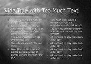
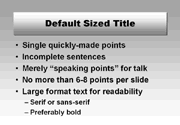
Most slides in a presentation can be divided into two types: text slides and data slides. A basic truism about text slides is that they should reinforce the points you are making in your talk-they shouldn't be the full text of your talk, or the audience will be trying to read the slides instead of listening to you. Limit the amount of text per slide to include only a brief summary of your key points; these will be your "bullet list" items on each slide that you'll expand upon with your talk.
|
|
In addition to limiting the amount of text on each slide, consider also limiting the number of points you present on each slide. Providing more than six to eight points on a slide will make it too cluttered and full of text and will overload the audience with topics. If you have multiple points to make on a single topic, spread them across multiple slides, possibly using "continued" in the slide title to clarify the connection. Some presentation packages also have the ability to dim points as they are made, which helps focus attention on the point at hand.
|
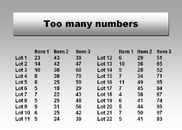
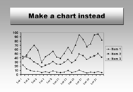
For data slides, remember that slides should be visual aids-so be visual, and use graphs wherever possible rather than multiple rows and columns of numbers. An audience will grasp a well-designed graph much more rapidly than an array of numbers. And, as above, overloading a slide with numbers means your audience will be trying to analyze data on the fly, rather than listening to what you are saying.
If you must provide data in numerical format on a slide, do so only with small arrays of numbers. Three rows and five columns of data are an approximate maximum to consider using on a slide. Sets of numbers larger than this are best delivered via a handout, preferably after your talk is over (to avoid distracting page-flipping and attempts at reading in a darkened room).
Tips on Slide Design
One of the trickiest points in creating a good slide is using effective colors. In selecting colors for your text and your background, your main concern should be contrast. The more your text contrasts with your background, the easier it will be to read. Because white and black are neutral colors, you can always use white text with a dark background or black text with a light background. Black text on light backgrounds has the additional advantage of being more legible when room lights can't be turned all the way down.
|
|
If you want to use colored text as well, pick colors that are complementary with the slide background. The topic of complementary colors is far too involved for this article; fortunately, most slide-creation software (such as Microsoft PowerPoint, Lotus Freelance Graphics, or Corel Presentations) includes color schemes that are complementary. As long as you stick to the default color schemes, your presentation should be within the realms of good taste.
One practical topic of color selection should be mentioned: color blindness. Approximately 10% of the male population is color blind, with red-green color blindness the most common. To make your presentation as accessible as possible, try to avoid red-green combinations, unless you also provide a difference in contrast, such as dark red text with light green background.
In addition to providing color schemes, presentation software packages also include prepackaged slide templates. These templates vary widely in look and feel, with everything from conservative to outlandish. Pick the more conservative of these templates-the others tend to include patterned backgrounds and background artwork that distract rather than inform. If you are creating your own background, or modifying an existing one, a solid color, or simple blue-to-black or green-to-black blend is often the safest, albeit overused, choice. Avoid background patterns unless they are very subtle.Your choice of typeface can also help to improve readability. Stick with bold typefaces and larger point sizes. The title of each slide should be larger than any subheadings, which in turn should be larger than the bullet points. Sans-serif typefaces such as Helvetica and Arial are usually preferred in slide presentations over serif typefaces such as Times or Garamond (the typeface used for The NIH Catalyst), but this is not a hard-and-fast rule. Some commercial serif typefaces, such as Adobe's Minion or Myriad, are much more readable than Helvetica. Finally, never use ALL UPPERCASE text, even in slide titles-it is very difficult to read.
Tips on Slide Output
After you've created your presentation materials, your on-campus resources for
making slides from a PowerPoint file are twofold. For the do-it-yourselfer, or those
short on time or funds, the Center for Information Technology (CIT) is located in
Building 10, Room 1C282, where a slide maker is available to Clinical Center staff;
however, you should make an appointment to familiarize yourself with the equipment.
For more details, visit its Web site at
If you prefer to drop off your file and pick up finished slides, the Medical Arts & Photography Branch (MAPB), located in Building 10, Room B2L323, has high-end slide-making capabilities at a cost of $4 per slide. Presentations can be dropped off via the NIH network or on disk, and there is a 24-hour turnaround time on slide production. MAPB can also create entire slide presentations, as well as custom illustrations and slide templates. Call MAPB at 496-3221 for more information, including specifics on how to avoid problems with slide output and preferred programs for creating slides.
For overheads, the Scientific Computing Resource Center (SCRC), Building 12A,
Room 1018, offers a Canon color laser printer and transparency material, as well as
dye-sublimation printers for high-quality transparency printouts. If you are going
to run overheads on your own printer, read the printer's manual carefully and only
use recommended overhead material-the wrong media will give poor results, or possibly
even melt in your laser printer. More information on SCRC services is available at
its web site:
Of Course, There's a Course
CIT's training program introduced a new course in April, entitled "Designing
Effective Scientific Slides" and taught by Karen Ours and Larry Ostby of MAPB, which
covers this information in more detail. There are plans to offer this course in
future semesters; consult the CIT Training Web page at
for dates and times. In the meantime, the foregoing tips can serve as a starting point for creating slides that wake listeners up when the lights go down.
__________
Footnote: Mention of a specific product inThe NIH Catalyst does not constitute an endorsement, and failure to mention a product does not imply its inferiority.
Festivities the Other Side of SummerWhat: The NIH Research FestivalWhen: October 6-9 Poster deadline: June 5, 5:00 p.m. Poster submission: on line or by fax. Details are available at the Festival '98 Web site: <http://silk.nih.gov/silk/fest98/>, accessed via the News and Events section of the NIH home page. To obtain a printed entry form or for more information, visit the Web site or call 301-496-1776. Art Levine, NICHD scientific director and chair of this year's festival organizing committee, says he and his colleagues-NINDS scientific director Story Landis and NEI clinical director Scott Whitcup-have put together a program that's both "less diffuse" and scientifically diverse. The festival kicks off Tuesday, October 6, with a day-long Job Fair for NIH postdoctoral fellows. The following three days of scientific meetings begin each morning with a plenary session of broad interest to the scientific community: Wednesday's is "The Origins of Life," a joint NIH-NASA program; Thursday's is "Apoptosis"; and Friday's is "Insight from the Bedside," a look at clinical science. The plenaries will be followed each day by six concurrent minisymposia. Poster sessions are slated for each afternoon. On Thursday and Friday, the Technical Sales Association will again run its popular Research Festival Exhibit, with displays of the latest lines of lab equipment. And for the piece de resistance, TSA will also host a lunch-time picnic each day, complete with musical entertainment provided by some "local talent," including The [legendary] Directors, appropriately named for the day jobs of band members Stephen Katz of NIAMS, Francis Collins of NHGRI, and NCI's Richard Klausner. |